
Trishaw MDY — Biz I Wanted to Do
How I used product design and service strategy to turn an endangered traditional ride into a repeatable evening relaxation habit.
The Mandalay Opportunity & Local Insight
Cultural Preservation Meets Daily Habit
Mandalay is Myanmar’s historic cultural city, famous for open skies and clear evening sunsets. For decades, pedal-powered three-wheel trishaws were the main way people got around town. They are slow, quiet, and have passenger seats angled backward—perfect for watching the scenery.
Today, motorbikes and tuk-tuks have pushed traditional trishaws out of work. While visiting Mandalay at golden hour, I wanted to take a ride to enjoy the evening breeze, but finding a driver was impossible. There was no simple way for riders and drivers to find each other.
The Big Idea: Relaxation Over Tourism
Most design briefs for this would say: “Build a tourist app.”
But tourism has a major problem: tourists take a ride once and go home. That forces the business to spend lots of money finding new tourists every month.
Instead, I focused on local residents:
— Product StrategyTrishaw MDY should be a repeatable relaxation habit — like getting a massage after work.
When people treat a quiet sunset ride as a weekly way to unwind from screen fatigue and enjoy fresh air, you get loyal, repeat customers all year round.
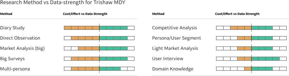
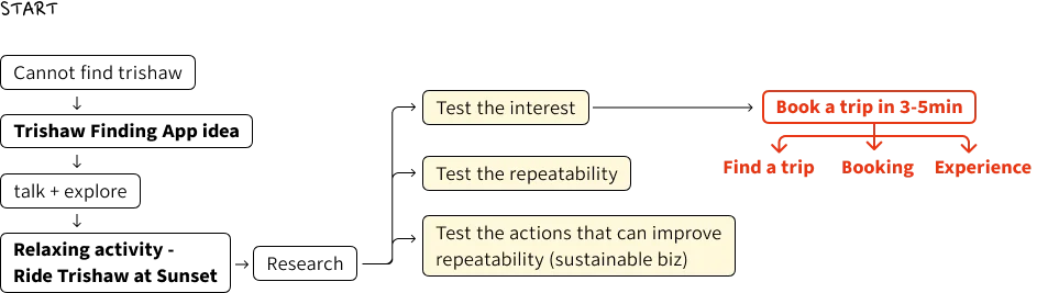
Focused Research Over Bloated Decks
Many design case studies fill dozens of pages with generic user personas and 50-question surveys.
I kept the research lean and focused on three real questions:
- Do local city workers actually want to pay for a 45-minute outdoor relaxation ride?
- Which scenic routes are safe, flat, and comfortable for drivers to pedal?
- Can drivers earn enough money to make this a proud, reliable living?
Designing a Frictionless Booking Experience
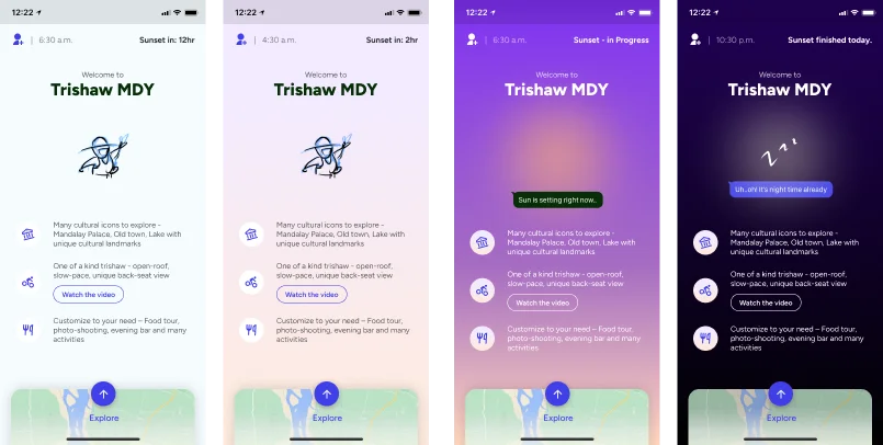
The Distraction-Free Home Screen
Most travel apps clutter their home screen with noisy banners, popups, and coupon carousels.
For Trishaw MDY, I kept the home screen completely quiet and focused:
- No promo banners: The entire focus is choosing a relaxing ride.
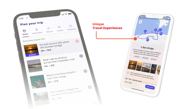
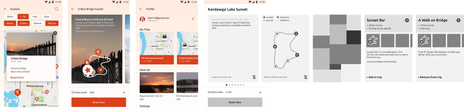
- Clear route cards: Each card shows the exact scenery, duration, price, and route map.
- Sunset-reactive colors: The app changes colors depending on the time of day, warming up as sunset approaches.
Choosing a Ride in Three Steps
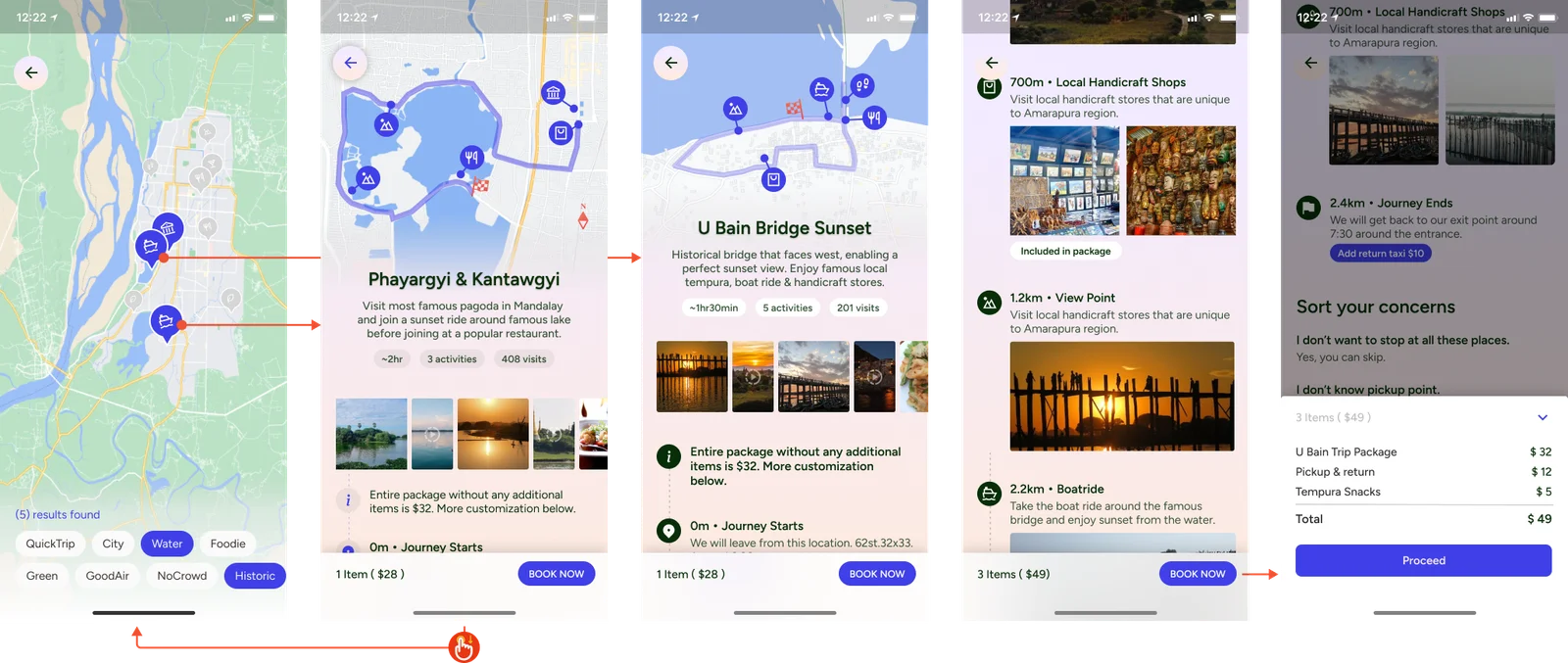
Instead of forcing users to build custom routes from scratch, the app offers curated evening rides:
Guest Booking & Smooth 6-Step Checkout
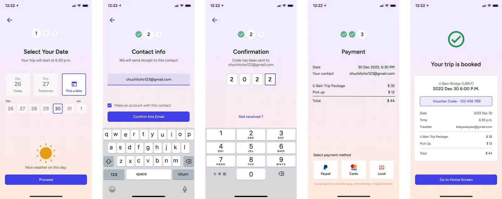
Nothing ruins a great mood faster than a screen that says “Create an account and choose a 12-character password” before you can even book.
With Trishaw MDY:
- Anyone can pick a route and time immediately.
- We only ask for a phone number on the last payment screen so the driver can call upon arrival.
- An account is created automatically via SMS code after the ride is confirmed.
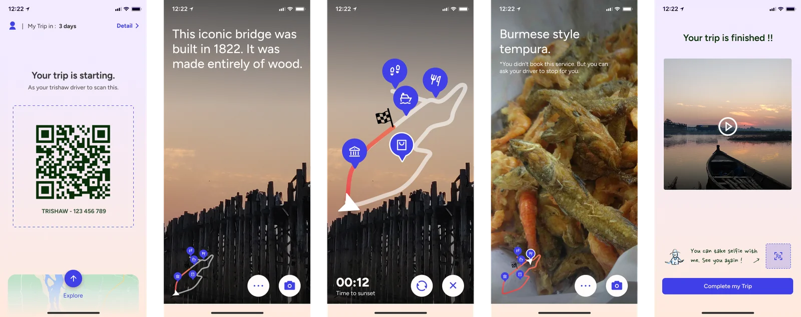
The checkout flow handles every detail clearly: date picker, rain protection, pricing, and live driver arrival.
Behind the Scenes, Architecture & Impact
The Complete Experience & Brand System
By focusing on user convenience and removing friction, booking a ride takes under two minutes from start to finish.
Grounding in Local Reality & Mobile-First Tradeoffs
Every part of this project was grounded in physical Mandalay reality:
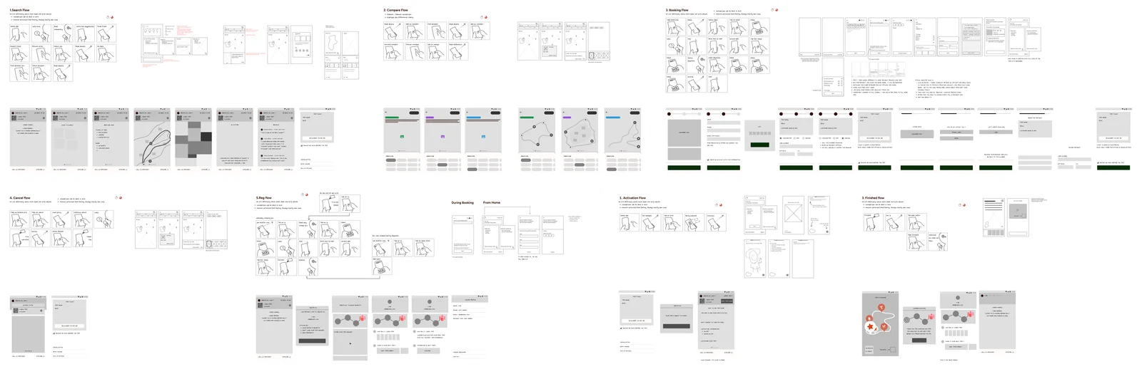
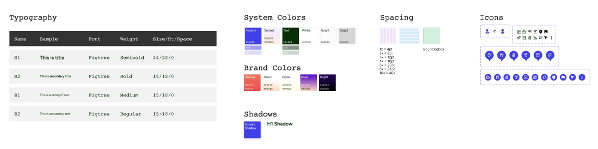
For this service, a mobile app was a deliberate choice:
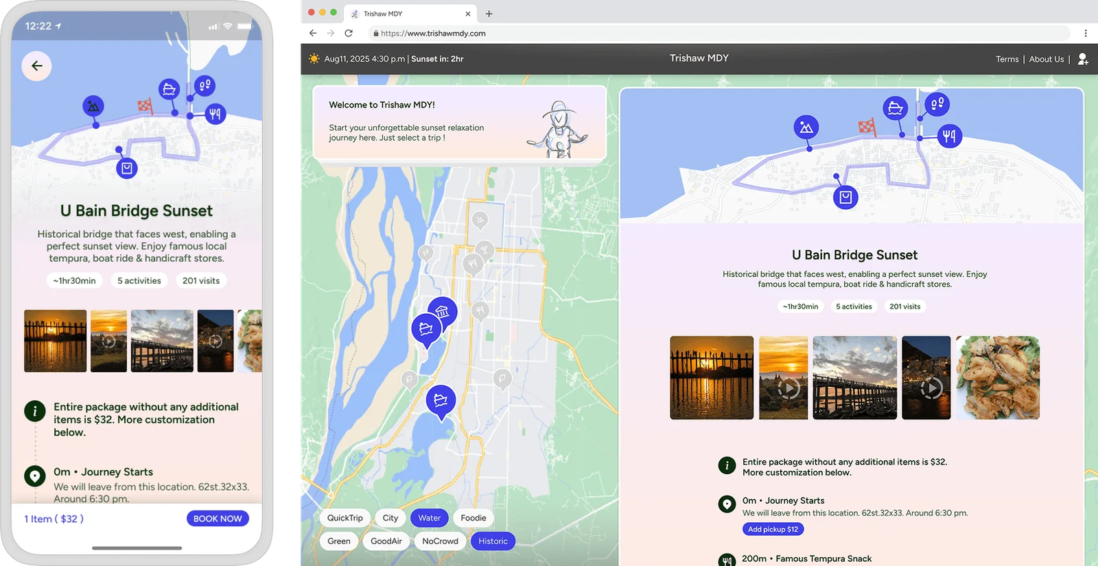
- One-tap access: Users don’t need to remember a website URL when they want an evening ride.
- Offline reliability: GPS location and cached route maps work smoothly even when internet coverage drops along riverbanks.
- Real-time updates: The app can vibrate and send push notifications when the driver is two minutes away.
Aligning Customer Habits with Driver Livelihoods
Great product design is not just about drawing clean screens. It is about understanding the economics of a service and building a product that people genuinely want to use again and again.
When you align customer habits with driver livelihoods, design can help keep cultural traditions alive.
You might also like
 Sep 15, 2026
Why Custom Apps Cost More Than People Expect
Understanding the real costs behind building software: team salaries, the challenge of building alone, and why an app is an ongoing commitment.
 Sep 15, 2026
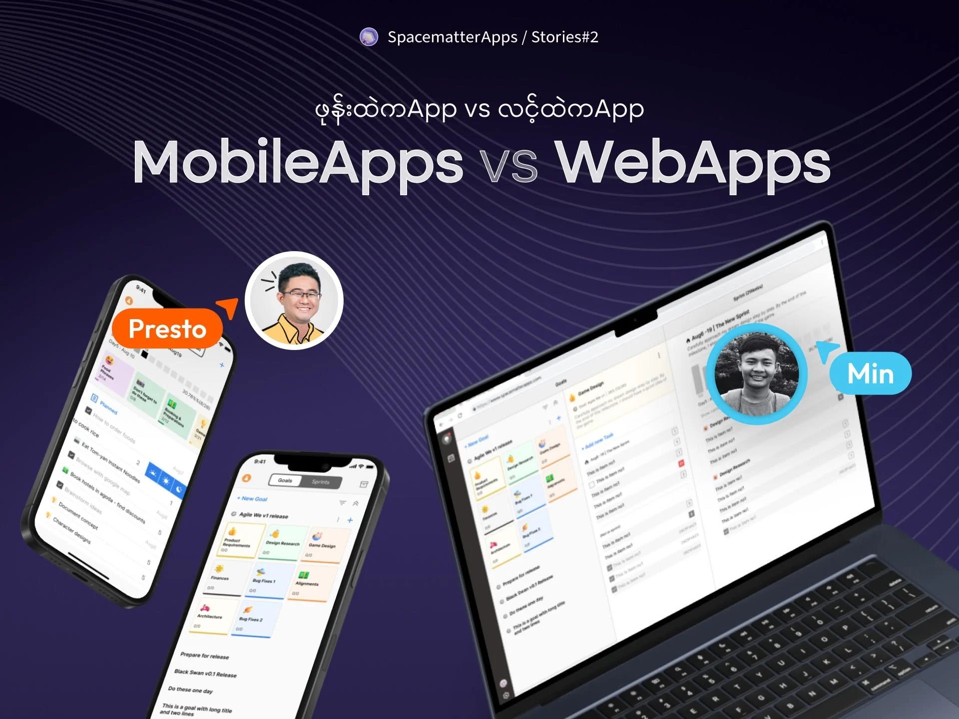
Mobile App vs. Web App: What Founders Need to Know
Understanding the real differences between an app you download from the store and an app that runs in your browser.
 Nov 27, 2023
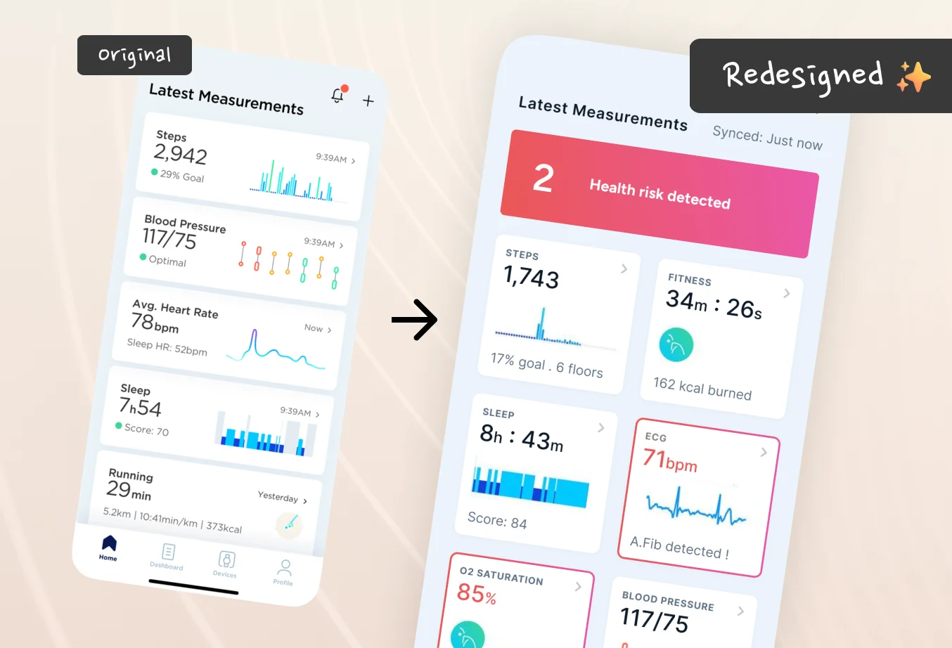
We should try this for Health App Dashboards (Redesigning Withings App)
I am redesigning this for educational purpose. I saw Withings’ announcement in CES 2023, their products look so polished that I started checking their website and found the app.